Widgets Node
What is a Widget?
A widget is a modular, interactive component that you can add to your learning flow to provide rich, engaging experiences for users. Widgets can be quizzes, image hotspots, presentations, quote cards, charts, and more. Each widget is designed to enhance interactivity, visualization, or assessment within your project. Widgets are highly configurable, allowing you to tailor their content, appearance, and behavior to your specific needs.
Widgets are managed through the Widgets Node in your flow editor, making it easy to add, configure, and update them as your project evolves.
Adding a Widgets Node
How to Add a Widget
To add a widget to your flow:
- Open your flow in the Editor.
- After the Start node, draw a connection line from the Start node, then use the node search to find and add the Widget node to your flow.
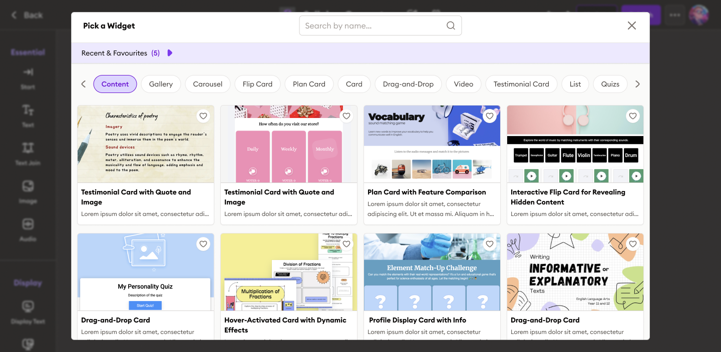
- Click the "Pick a Widget" button in the Widgets node.
- Browse or search for the widget type you want (e.g., Presentation, Image Hotspot, Quiz, etc.).
- Click the widget card to select and "Use this Widget" to add into your flow.
- The widget will be added to your flow, ready for configuration.

Featured Widget Types
Widgets come in a variety of types, including:
- Display Grids: Organize visual content in customizable layouts
- Image Hotspot: Interactive images with clickable hotspots
- Presentation: Tabbed presentations with icons and hierarchical structure
- Quiz Template: Configurable quizzes with multiple question types
- Quote Cards: Stylish quote displays with layout options
- Word Bank: Grammar challenges with interactive gameplay
- Bubble Chart: Dynamic data visualizations
Creating a New Widget Configuration
Each widget can be configured to match your requirements. You can create a new configuration in two main ways:
1. Using the Configuration Panel (Recommended)
- After adding a widget, you can click the "Create New Configuration" button at any time.
- Fill out the available fields. Common options include:
- Instructions: Provide context or guidance for the widget (e.g., "Highlight the main organs in this diagram").
- Image URL: For image-based widgets, paste the image link.
- Color Palette: Select or customize the color scheme.
- Generate Button: Click the Generate button.
- Click the "Preview" to see your changes before saving.
2.Editing Widget Configuration
If you want to make further changes after previewing:
- Click the Edit button (usually at the top right of the preview screen).
- You can update various settings, such as:
- Information: Describe the usage tips to edit the widget.
- Tabs: Add, remove, or reorder tabs (for widgets like Presentation Tabs).
- General Settings: To Update Main title, subtitle for the widget.
- Theme Colors: Customize the color palette for backgrounds, accents, and states.
- The available editing options and values will differ depending on the type of widget you select.
- After editing, use the preview feature to verify your changes.
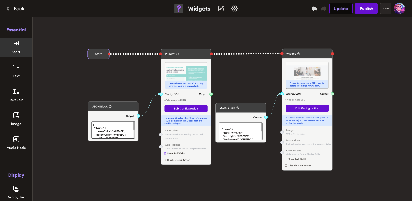
3. Using JSON Configuration (Advanced)
- For full control, connect a JSON Block to the widget node.
- Click "Edit Configuration" and switch to JSON view.
- Modify or paste your custom JSON configuration. This allows you to specify all available options, including advanced settings not visible in the UI.
Display Options
Each widget includes two display options that let you customize how the widget appears and behaves:
- Show Full Width: Expands the widget to the full width of the container or screen.
- Disable Next Button: Prevents users from advancing until an interaction or condition is met.
Display options are available in the configuration panel for each widget.
Example Widget Configurations
Each widget comes with its own configuration panel, which may look different depending on the type of widget you select. The configuration options are tailored to the widget’s purpose and template.
Common Configuration Options
-
Image Hotspot:
- Image URL
- Instructions for labeling or highlighting
- Add clickable hotspots
- Color Palette
-
Scroll Rects:
- Instructions (optional guidance)
- Select Colors
-
Presentation Tabs:
- Instructions
- Color Palette
-
Quiz Template Generator:
- Instructions
- Color Palette
 (See the screenshots above for common configuration options.)
How to Use the Quiz Template Generator
Follow these steps to generate a quiz using the Quiz Template Generator widget:
-
Add the Quiz Template Widget
- In your flow, click the “Pick a Widget” button and select the Quiz Template Generator.
-
Enter Instructions
- In the Instruction field, write what you want the quiz to cover.
Example:
generate 5 quizzes for grade 1 'Sun, Moon and Star'
- In the Instruction field, write what you want the quiz to cover.
-
Choose a Color Palette
- Select a color palette for your quiz from the suggested palettes or create your own by clicking + Add Color.
-
Generate the Quiz
- Click the Generate button.
- The widget will automatically create quiz questions based on your instructions and selected colors.
-
Preview and Edit
- Review the generated quiz.
- If needed, edit the questions or color palette using the configuration panel.
-
Save and Connect
- Once satisfied, save your configuration and connect the widget to the rest of your flow.
Tip:
Explore each widget’s configuration panel to see which options are available for that template. Use the preview feature to check your changes before saving.