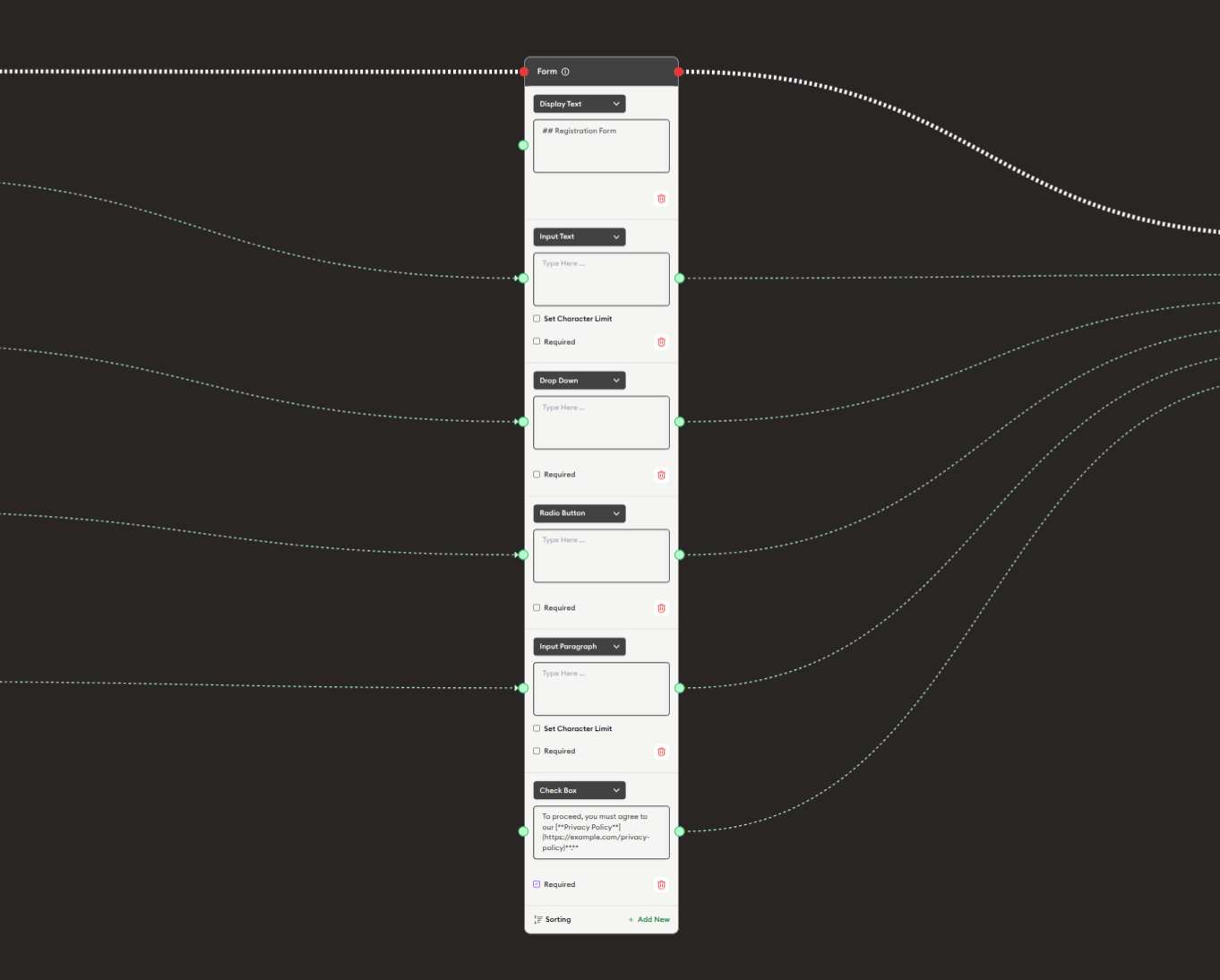
Form
The Form node creates interactive forms to collect user input during workflow execution. It supports multiple field types including text inputs, dropdowns, text areas, action buttons, and checkboxes. The Form node is essential for gathering structured data, conducting surveys, collecting assignments, processing registrations, and any scenario requiring user-provided information. Each field can be configured with validation rules, required status, and character limits.
Basic Usage
Use the Form node to collect information from users through customizable input fields. Configure multiple fields with different types, connect the form outputs to process submitted data, and validate user responses.
Inputs
The Form node does not have input ports for receiving data from other nodes. It operates as a user input collection node where users directly enter information.
Outputs
Output (Green Port - Multiple Dynamic Handles)
Field Data Outputs: Each form field creates its own green output port.
- Individual output for each field you create
- Outputs the data entered in that specific field
- Connects to green input ports of subsequent nodes
- Field outputs available after form submission
- Can connect to different nodes for different fields
- Use "+ Add handle" to create more output connections for a field
Example Field Outputs:
- "Display Text" field → Text content entered
- "Name" field → Name entered
- "Email" field → Email address entered
- "Dropdown" field → Selected option
- "Checkbox" field → true/false or checked/unchecked
Output (Red Port)
Flow Control: Continues execution to the next node after form is submitted.
- Connects to red input ports of subsequent nodes
- Allows workflow to continue after user submits form
- Standard flow progression connection
- Triggered when user clicks submit/action button
Configuration
The Form node uses a dynamic field builder system where you add and configure multiple fields:
Field Types
1. Display Text
Read-only text display within the form.
Configuration:
- Field label/title (e.g., "Display Text")
- Content area for text to display
- No user input collected
- Use for instructions or information
Example:
Label: "All Responses Fields"
Content: "Please complete all sections below."
2. Name Text
Single-line text input field.
Configuration:
- Field label (e.g., "Name Text")
- Placeholder text (optional)
- Character limit (e.g., "Set Character Limit")
- Required checkbox
- Input area for user entry
Use Cases:
- Names
- Short answers
- Single-line responses
- Titles or labels
Example:
Label: "UserName/Your name here..."
Required: ☑
Character Limit: 50
3. Drop Down
Dropdown selection menu.
Configuration:
- Field label (e.g., "Drop Down")
- Dropdown options list
- Required checkbox
- Single selection only
Use Cases:
- Predefined choices
- Categories or classifications
- Single-option selection
- Menu navigation
Example:
Label: "Select Country of Residence"
Options:
- USA
- Canada
- UK
- Other
Required: ☑
4. Action Button
Clickable button field.
Configuration:
- Field label (e.g., "Action Button")
- Button label text
- Required checkbox
- Button action/trigger
Use Cases:
- Custom actions
- Conditional submissions
- Multi-step forms
- User confirmations
Example:
Label: "Additional Comment"
Button Text: "Add Comment"
Required: ☐
5. Input Paragraph
Multi-line text area input.
Configuration:
- Field label (e.g., "Input Paragraph")
- Text area for longer input
- Character limit option
- Required checkbox
Use Cases:
- Essays or long responses
- Descriptions
- Comments or feedback
- Detailed explanations
Example:
Label: "Please describe yourself in detail (max 500 words)"
Required: ☑
Character Limit: 2500
6. Check Box
Checkbox for agreement/confirmation.
Configuration:
- Field label (e.g., "Check Box")
- Checkbox statement/text
- Required checkbox
- Sorting order
- "+ Add field" option
Use Cases:
- Terms and conditions acceptance
- Consent forms
- Yes/no confirmations
- Privacy policy agreements
- Multiple selections
Example:
Label: "Check Box"
Text: "By proceeding, you must agree to our privacy policy [link to privacy policy/terms...]"
Required: ☑
Field Options
Each field can be configured with:
-
Required Checkbox
- Mark field as mandatory
- Users must complete before submission
- Validation prevents submission without completion
-
Set Character Limit
- Restrict input length
- Available for text fields
- Prevents overly long responses
-
Sorting
- Reorder fields in form
- Use sorting controls
- Organize form layout
-
Add field / + Add field
- Add more fields to form
- Build multi-field forms
- Create complex forms
-
Remove Field (Red X)
- Delete unwanted fields
- Clean up form structure
- Remove during configuration
Example Workflows
Basic Information Collection
Scenario: Collect user contact information.
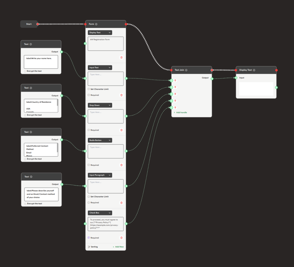
Steps to Create the Flow:
-
Add a Start Node.
-
Add a Form node:
i. Add fields:
- Click "+ Add field"
- Select field type (Name Text, Input Paragraph, etc.)
- Configure each field
ii. Configure first field (Name):
- Type: Name Text
- Label: "Your Name"
- Placeholder: "Enter your full name"
- Required: ☑
iii. Add email field:
- Type: Name Text
- Label: "Email Address"
- Required: ☑
iv. Add comment field:
- Type: Input Paragraph
- Label: "Comments"
- Character Limit: 500
- Required: ☐
-
Add Text Join node:
- Connect form field outputs to Text Join inputs
- Aggregate all submitted data
-
Add Display Text node:
- Show confirmation or collected data
- Connect Text Join output
-
Connect flow control:
- Start → Form → Text Join → Display Text (red ports)
Preview:
[Start] → [Form: User fills out fields]
       → [Text Join: Combine data]
       → [Display Text: "Thank you! Your response has been recorded."]
Result: Users complete the form, data is collected and confirmed.
Related Nodes
- Display Text: Provide form instructions and confirmations
- Text Join: Aggregate multiple form field outputs
- Data Dump: Store submitted form data
- AI General Prompt: Process form responses with AI
- AI General Feedback: Evaluate form submissions
- Branching Node: Route based on form responses
- Display Quiz: Alternative for quiz-type questions
- PDF Upload: Alternative for file submissions
Summary
The Form node is essential for structured data collection:
✓ Versatile: Multiple field types for any data
✓ Flexible: Dynamic field management
✓ Validated: Required fields and character limits
✓ Powerful: Multiple outputs for processing
✓ Essential: Core tool for user input
Master the Form node to create sophisticated data collection workflows that gather information effectively, validate responses, and process user input for educational assessments, registrations, surveys, and any scenario requiring structured user data.