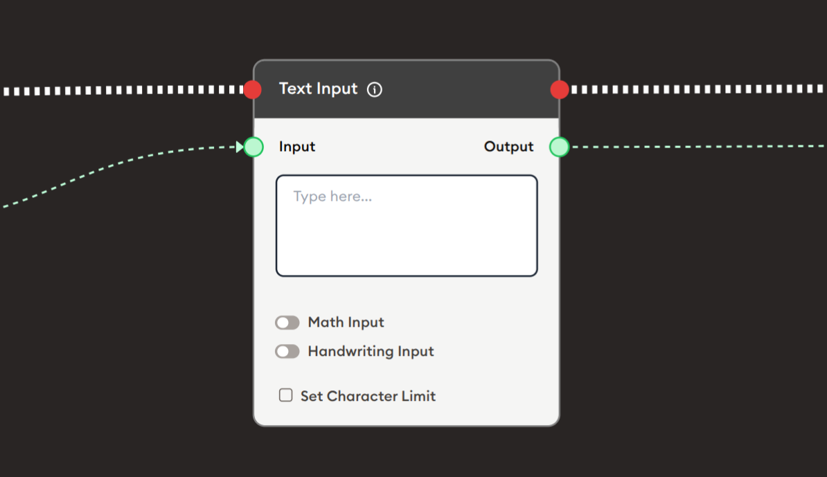
Text Input
The Text Input node collects free-form text input from users during workflow execution. It provides a simple text area where users can type responses, answers, essays, or any textual data. The node supports special input modes including Math Input for mathematical expressions and Handwriting Input for drawing/writing, as well as character limit controls. It's essential for gathering user responses, collecting feedback, enabling interactive exercises, and any scenario requiring text-based user input.
Basic Usage
Use the Text Input node to collect text from users. Configure the placeholder text, enable special input modes if needed, set character limits, and connect the output to subsequent nodes for processing or display.
Inputs
Input (Green Port)
Pre-fill Text: Receives text data to pre-populate the input field.
- Connects to green output ports from previous nodes
- Optional input - field can be empty by default
- Can display instructions or default text
- User can modify pre-filled text
- Useful for templates or guided responses
Outputs
Output (Green Port)
User Input Text: Outputs the text entered by the user.
- Connects to green input ports of subsequent nodes
- Contains the text typed or drawn by the user
- Available after user completes input and proceeds
- Can be used for AI processing, display, storage, or validation
- Empty string if user doesn't enter anything
Output (Red Port)
Flow Control: Continues execution to the next node after user submits input.
- Connects to red input ports of subsequent nodes
- Standard flow progression
- Triggered when user proceeds/submits
- Allows workflow continuation
Configuration
The Text Input node provides options for enhanced input methods and validation:
Text Input Area
Main input field where users type their response.
- Multi-line text area
- Placeholder text: "Type here..."
- Supports multiple lines of text
- Auto-expands as user types
- Copy/paste functionality
- Standard text editing
Math Input
Toggle to enable mathematical expression input.
- ☐ Unchecked: Standard text input (default)
- ☑ Checked: Enables math equation editor
- Allows mathematical notation
- Supports symbols, formulas, equations
- Renders math expressions properly
- Useful for STEM subjects
When enabled:
- Math toolbar appears
- Insert symbols (∑, ∫, √, π, etc.)
- Create fractions, exponents, subscripts
- Build complex equations
- LaTeX-style input support
Use cases:
- Math problems and solutions
- Scientific formulas
- Engineering calculations
- Physics equations
- Chemistry notation
Handwriting Input
Toggle to enable drawing and handwriting.
- ☐ Unchecked: Standard text input (default)
- ☑ Checked: Enables drawing canvas
- Allows freehand drawing
- Handwriting recognition (if supported)
- Sketch diagrams or write naturally
- Touch/stylus support
When enabled:
- Drawing canvas appears
- Pen/brush tools available
- Can write with mouse, touch, or stylus
- Drawing saved as image
- Potential handwriting-to-text conversion
Use cases:
- Handwritten answers
- Diagrams and sketches
- Signatures
- Visual explanations
- Language writing practice
- Art or design input
Set Character Limit
Checkbox to enable maximum character restriction.
- ☐ Unchecked: No character limit (default)
- ☑ Checked: Enables character count limit
- When checked, input field appears to set limit
- Prevents excessively long responses
- Shows character counter to user
- Enforces limit during typing
Configuration when enabled:
- Enter maximum character count
- Example: 500, 1000, 5000
- Counter displays: "450/500 characters"
- User cannot type beyond limit
Use cases:
- Short answer questions (100-200 chars)
- Tweet-length responses (280 chars)
- Essay length control (1000-5000 chars)
- Database field constraints
- Prevent overwhelming responses
Example Workflows
Simple Text Collection
Scenario: Collect user input and display it back.
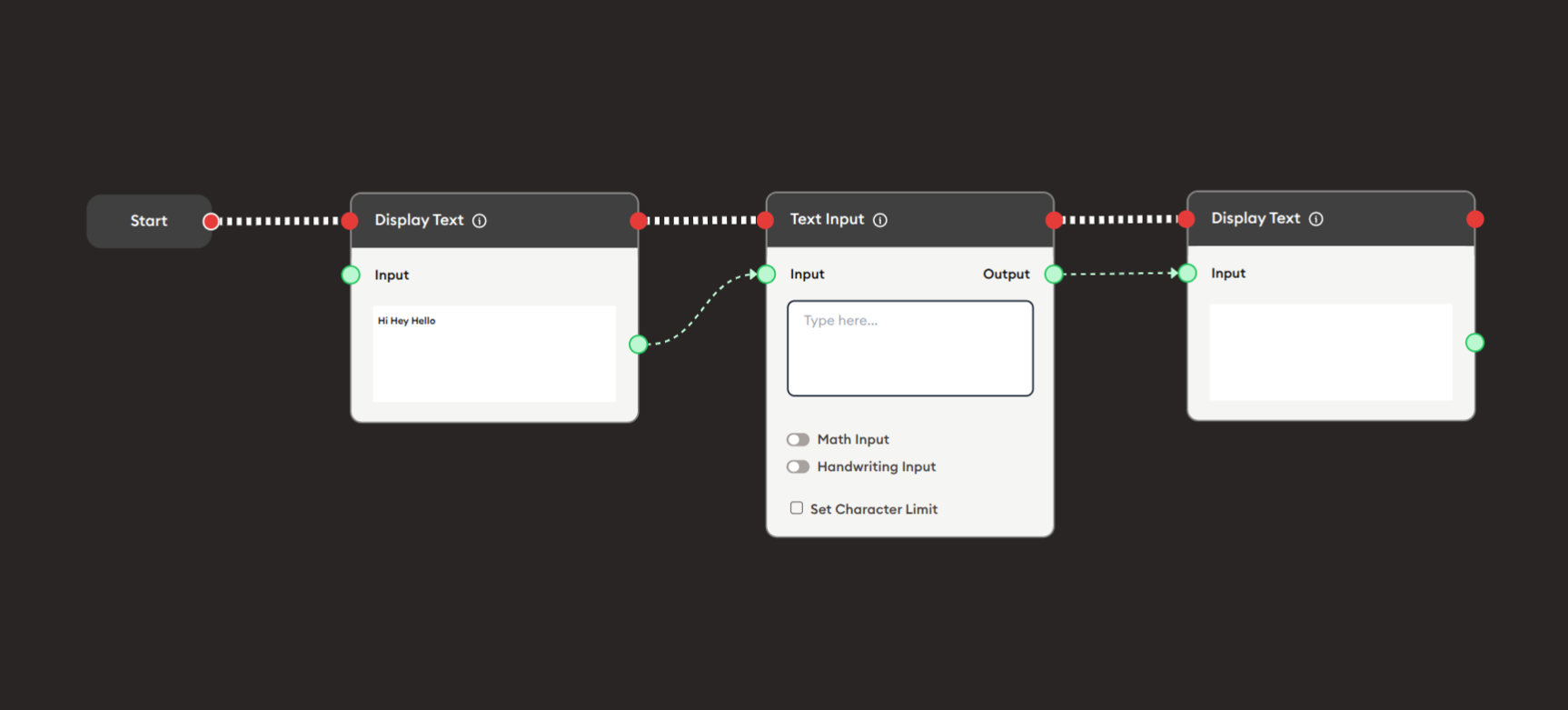
Steps to Create the Flow:
-
Add a Start Node.
-
Add a Display Text node (first):
- Input: Pre-filled text "Hi Hey Hello"
- Shows greeting to user
-
Add a Text Input node:
i. Configure the input:
- Placeholder: "Type here..."
- Math Input: ☐ (unchecked)
- Handwriting Input: ☐ (unchecked)
- Set Character Limit: ☐ (unchecked)
ii. Connect inputs:
- Optionally connect Display Text output to Input (for pre-fill)
-
Add a Display Text node (second):
- Connect Text Input output to Input
- Displays what user entered
-
Connect flow control:
- Start → Display Text → Text Input → Display Text (red ports)
Preview:
[Start] → [Display Text: "Hi Hey Hello"]
       → [Text Input: User types response]
       → [Display Text: Show user's input]
Result: User sees greeting, enters text, sees their input displayed.
Related Nodes
- Display Text: Show instructions or collected text
- Form: Alternative for multiple structured inputs
- AI General Prompt: Process user input with AI
- AI General Feedback: Evaluate and grade text responses
- Text Join: Combine multiple text inputs
- Data Dump: Store user input for later retrieval
- Branching Node: Route based on input content or length
- PDF Upload: Alternative for document submissions
- Audio Input: Alternative for voice input
Summary
The Text Input node is essential for collecting user text:
✓ Flexible: Free-form text collection
✓ Enhanced: Math and Handwriting input modes
✓ Controlled: Optional character limits
✓ Simple: Single-purpose text collection
✓ Powerful: Enables interactive learning and feedback
Master the Text Input node to create engaging interactive workflows that collect user responses, enable creative expression, gather feedback, facilitate assessments, and support any learning activity requiring textual user input. Combine with AI nodes for automated evaluation and feedback, or use multiple Text Input nodes for comprehensive data collection.